Generated from the Figma file VMrMBZC3y8lOfxic25V7HT. Link
tokens.css → typography.css → components.css,
in that order. See README.md for the regeneration workflow.
Chip .pl-chip · PLChip 925:12624
Form page "Form" · 798:1537 / 800:31
Text and password inputs from the Form page. Each component set has five
states — Placeholder, Disabled, Focused,
Filled, and Error. Focus uses a 2px inset stroke via
:focus-within (and .is-focused for static demos).
Password fields use #pl-eye-slash / #pl-eye at 24px.
Text field · 798:1537
Password field · 800:31
Search bar .pl-search-bar · 1832:2160
Both icon slots are booleans in Figma — Leading icon defaults on,
Trailing icon defaults off, so the clear button only appears once there's a
value. The label is its own two-variant component: Active=False is the
placeholder (text/secondary), Active=True the typed value
(text/primary). Figma's icons are SF Symbol glyphs; these are the
sprite equivalents.
Class card .pl-class-card · 1361:5034
Schedule card .pl-schedule-card · 1194:1271 · 12925:349238
Venue detail omits the studio line. Search schedule view
adds __venue (bodySmall regular) between the
title and the rating row — same card, location included because
results span multiple venues.
Pack .pl-pack · 14262:67737 / 14262:67740
Drop-in / Pack picker for the booking flow. Built on
.pl-card — selected is .is-selected.
Title and price share the top row. Drop-in is qty only (no footer).
Pack adds a unit price, optional green Save badge
(caption/lg/medium on surface/variant/green),
and an icon-row terms footer with an underlined
+ N more locations link
(#pl-calendar-small, #pl-location-pin-small).
Review card .pl-review-card · 1306:5340
Ratings summary .pl-ratings-summary · 1321:5446
Rating distribution .pl-rating-distribution · 1323:5708
Map card & See all .pl-map-card / .pl-see-all · 1662:1623 / 1662:1693
Booking card .pl-booking-card · 12909:348896
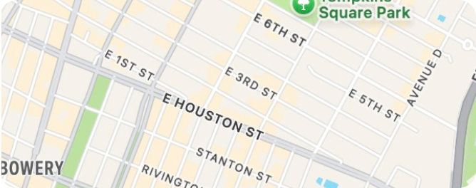
Upcoming reservation on the Bookings tab. Map preview is
assets/map_bookings.png (static stand-in — the prototype uses
a Mapbox image of the actual venue). Pin is
assets/map-card-pin-chrome.svg (exact bubble) with a 50×50
venue thumbnail. Actions are Neutral /
Small / Pill PLButtons — Add uses #pl-calendar-add-16, Directions
uses #pl-directions.

Venue card .pl-venue-card · 1456:15761
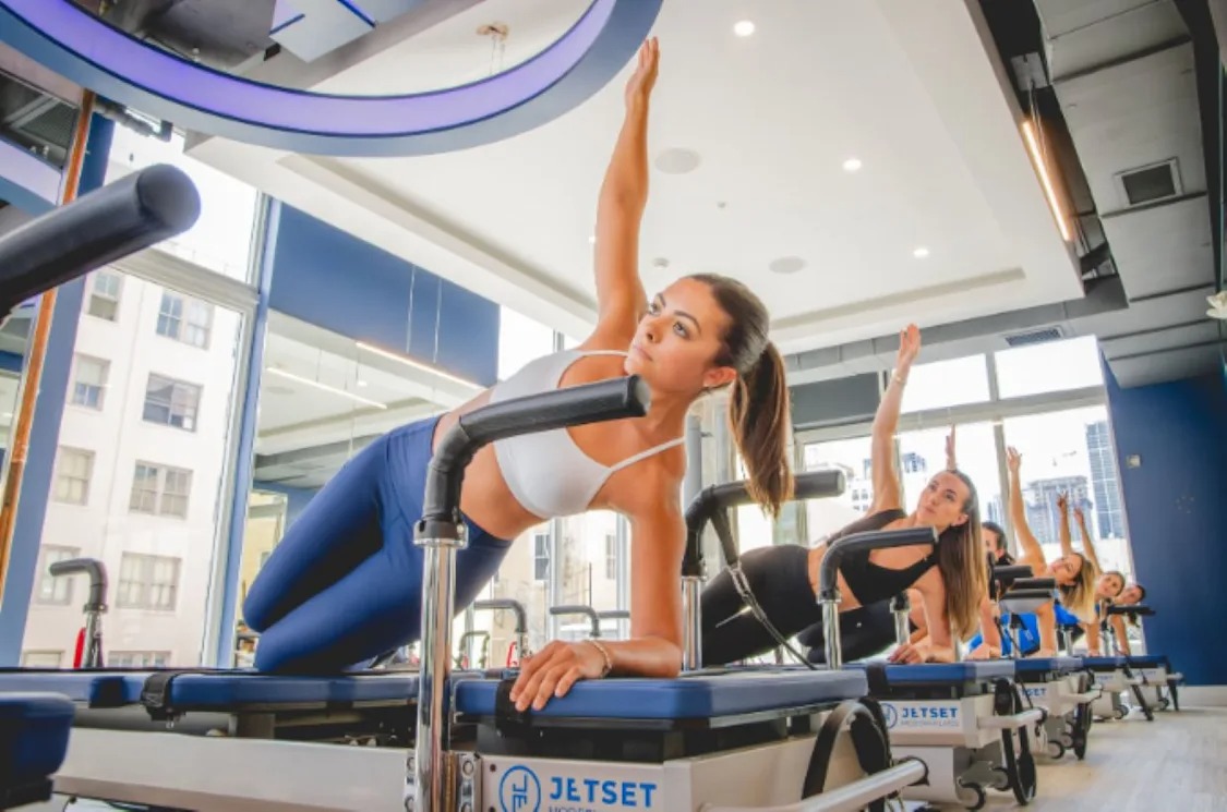
The image is a square sized by the info column, not a fixed size — so the
header is a grid rather than a flex row (a flex item's width stays indefinite, leaving
aspect-ratio nothing to resolve against). The action slot is a real PLButton;
Figma's instance is Neutral / Small / Pill. † The header is 106px now that Small buttons
are 34px — Figma's saved card still reads 108 because that button instance is holding
stale geometry; its main component is 34.
Checkout card .pl-checkout-card · 2511:10595 · 2510:10502 · 12946:389454
Booking checkout summary — class details, selected payment line, and an
optional promo row. Drop-in is product + qty/price; Pack swaps in remaining-count
and expiry lines with __product--pack, __details, and
__row--pack. Promo row is 12880:342437 — centered
tag + label, no chevron; icon is #pl-tag at 16px.
Pack redeem (12946:389454) uses .pl-checkout-card--class-only
plus a .pl-pack-card under a Reserve with heading — no payment.
Pack redeem · 12946:389454 — class card + owned pack, no payment
Reserve with
10 class card (mat + towel)
4 of 10 visits left
Payment section .pl-payment-section · 2511:11765 · 2511:11842
Checkout payment card — saved card row, Change link, and a collapsible
total. Collapsed shows Total only; expanded (.is-expanded) reveals
Subtotal and Taxes above Total and rotates #pl-chevron-down-small.
Visa mark is assets/Visa.svg (exact export).
Collapsed · tap Total to expand
 •••• 4242
Expanded · .is-expanded
•••• 4242
Success modal .pl-success-modal · 12745:182045
Booking-confirmed bottom sheet after checkout. Checkmark is
assets/check_success.svg (exact export). Detail-row icons are
#pl-calendar-small, #pl-person-small, and
#pl-location-pin-small; Add uses #pl-calendar-add and
Share uses #pl-share-small. Close is
.pl-icon-btn--raised with #pl-close.

You’re booked!
Cancel modal .pl-cancel-modal · 12909:345909 / 12909:346047
Cancel-reservation sheet from Playlist App MVP. Two variants differ only in
the policy inset copy and fill — drop-in uses surface/inset;
pack uses surface/subtle. Toolbar close is
.pl-icon-btn--raised with #pl-close; CTA is
.pl-btn--inverse.
Drop-in · 12909:345909
Cancellation Policy
After canceling, you’ll get this visit returned to your balance to rebook, good until [expiration date]
Reformer Vitality
Class pack · 12909:346047
Cancellation Policy
After canceling, you’ll get a visit returned to your pack, good until [pack expiration date].
Reformer Vitality
Cancel confirm modal .pl-cancel-confirm-modal · 12909:346164 / 12909:346314 · pack 12946:389175
Post-cancellation success sheet from Playlist App MVP. Checkmark is
assets/check_success.svg (same export as booking success). Drop-in
(12909:346164) returns a visit to balance and offers a neutral
Find a class pill with #pl-calendar-small. Pack
(12909:346314) shows a pack summary card (12946:389175)
with title, expiry, and visits-left badge. Both end with an inverse
Done CTA.
Drop-in · 12909:346164
Reservation canceled
Class pack · 12909:346314
Reservation canceled
10 class card (mat + towel)
9 of 10 visits left
Tab bar .pl-tab-bar · 1495:394
Icons are #pl-tab-home / -search / -bookings /
-profile from the sprite, at the 25px size Figma uses. Figma applies a GLASS
effect to the bar; there's no CSS equivalent, so this is a solid
surface/default pill with the drop shadow.
Icons .pl-icon · Figma page "iOS icons"
Injected as an inline SVG sprite by icons.js — external
<use href="file.svg#id"> is blocked on file://, and these
prototypes get opened directly as often as they get served. Monochrome icons are
currentColor, so they take the colour of whatever they sit in. The three
stars and map-pin are vector paths that are two-tone by design, painting
fixed colours (icon/rating / icon/disabled / icon/red
+ white) directly instead of currentColor. Each sprite id is #pl- +
the name below. Multi-colour marks (e.g. Google) live in assets/ and are
referenced with <img>.
In component slots
Figma parity measured in this browser
Every component above is measured live and compared against the dimension
Figma reports. If you edit components.css, reload and check this table.
| Element | Figma | Rendered |
|---|
† Venue card: 106px now that Small buttons are 34px — Figma's saved card still reads 108 because that button instance is holding stale geometry; its main component is 34.